ShopDreamUp AI ArtDreamUp

Deviation Actions


Description
Me on Facebook!
---
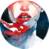
For my studio final, I had to go and "remake" my original draft, based on the same idea

These paintings were trying to look at how the human mind is like the sea in how they are flowing, constant and vast. It sounds really wacko and is a mouthful, but my teacher really stressed us to latch onto a really "sophisticated" theme or idea for our studio final, hence, this whacko idea! But I love the stuff I was able to produce!!
---
Some more of my works


---
For my studio final, I had to go and "remake" my original draft, based on the same idea
These paintings were trying to look at how the human mind is like the sea in how they are flowing, constant and vast. It sounds really wacko and is a mouthful, but my teacher really stressed us to latch onto a really "sophisticated" theme or idea for our studio final, hence, this whacko idea! But I love the stuff I was able to produce!!
---
Some more of my works
Image size
2829x1986px 932.49 KB
© 2014 - 2024 kelogsloops
Comments89
Join the community to add your comment. Already a deviant? Log In
Your concept and design are lovely. The shapes of the hair are very appealing and have a nice flow. I like how you elaborated them compared to the previous version. The shading of her skin is also nice, especially the backlighting. In general the colors are combined very well and create a refreshing mood. I find her different eyes to be very interesting (I have a friend who is like that <img src="e.deviantart.net/emoticons/b/b…" width="15" height="15" alt="
In spite of all that, though, I still prefer the earlier drawing, for the following aspects: the composition seems more balanced with the face bigger and more centered; the red headband was a nice pop of color and combined with the earrings and the facial expression added something whimsical and unique to the character that seems lost here; the face is more realistic in this version but I think the exaggerations in the previous one fit the style better; the mouth color looked more natural and fresh; and finally, I don't know if it's intentional or not but her face here looks a little asymmetrical, as in her right eye is a bit too far up and away from the other.
All of that said, I don't want you to be left under the impression that I don't like the drawing. On the contrary, I find it very refreshing and eye-pleasing. I just prefer the earlier version and I think you shouldn't have changed it so much.
May your muse never get tired! <img src="e.deviantart.net/emoticons/h/h…" width="15" height="13" alt="
Daniela